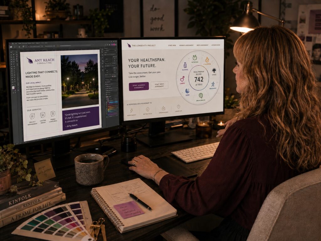
Designer working in a dual-monitor creative studio

Design that works
in the real world

Brand identity.
Print and publication.
WordPress and digital.

Clear thinking, careful craft, and digital work built to last.

I’m Nicole Desjardins. I build identities, publications, and WordPress experiences for organizations that need their ideas to be understood—not merely noticed.

SELECTED CASE STUDY

A brand system with Amy’s point of view

Amy Keach needed an identity that could hold authority, wit, and a little edge without drifting into corporate shorthand. The result is a flexible system that feels recognizably hers, from the smallest mark to the full website.

Amy Keach Consulting identity system
Fairy Slippers website design

A storybook world that still feels easy to use

The Fairy Slippers site carries the books’ illustrations and sense of discovery into the browser. Clear navigation gives the artwork room to be expressive while helping families find previews, activities, and the story behind the series.

AI TRAINING & EVALUATION

Good AI still needs good judgment.

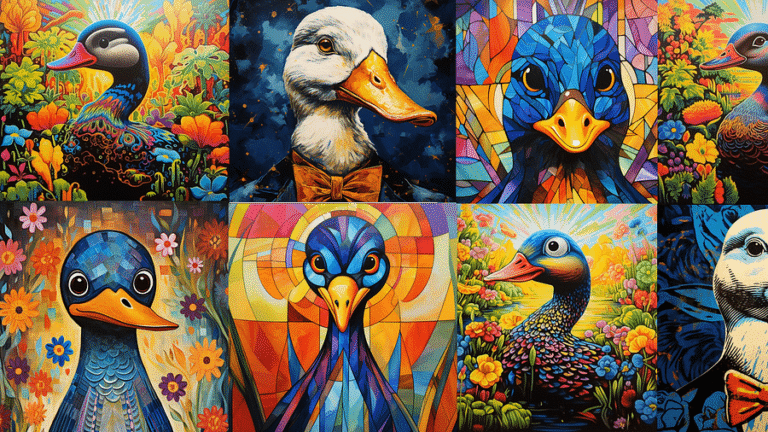
I review AI-generated text and images for accuracy, instruction-following, consistency, and visual quality—then explain which response is stronger and why.

01 / MODEL EVALUATION

Response quality & preference ranking

Compare responses against instructions and review criteria, identify meaningful errors, and document why one response is stronger.

02 / MULTIMODAL REVIEW

Visual & creative evaluation

Review text-and-image responses for composition, typography, brand fidelity, artifacts, realism, and whether they follow the prompt.

03 / QA & CALIBRATION

Consistency, edge cases & failure modes

Clarify edge cases, document recurring failure modes, and help reviewers apply the same standards consistently.

REPRESENTATIVE EVALUATION

Which response actually follows the prompt?

A simple example of the kind of judgment AI evaluation requires.

PROMPT

Create a homepage hero for a premium architecture studio. Keep the supplied neutral identity, use an editorial tone, avoid unsupported claims, and include one clear call to action.

RESPONSE AWeaker fit

Adds an unrequested blue gradient, generic imagery, two calls to action, and a sustainability claim that was never provided.

RESPONSE BPreferred

Keeps the neutral identity, establishes one clear hierarchy, and uses a single call to action. One contrast issue still needs correction.

InstructionsBrand fidelityHierarchyTypographyAccuracyUsefulness
WHY B WINS

B follows the visual and content constraints. A introduces claims and a direction that were never requested. B is not flawless, but it is the stronger and more useful starting point.

ABOUT THE PRACTICE

Design experience shaped by technology

I’m Nicole Desjardins, a designer who works across brand identity, publication, WordPress, and AI evaluation. The formats have changed considerably over the years; the fundamentals have not. I still care about typography, hierarchy, clarity, consistency, and whether the finished work actually solves the problem it was meant to solve.

Current work, experiments, and ideas

Selected brands and identities

John Krol for Mayor
Amy Keach Consulting full logo
Amy Keach Consulting icon
Accurate Alert logo
Dean Maser logo
Happy Valley Skate logo
Jenna Reid Psychic Medium logo
Pitchmasters logo
Stone Soup Cafe logo